-
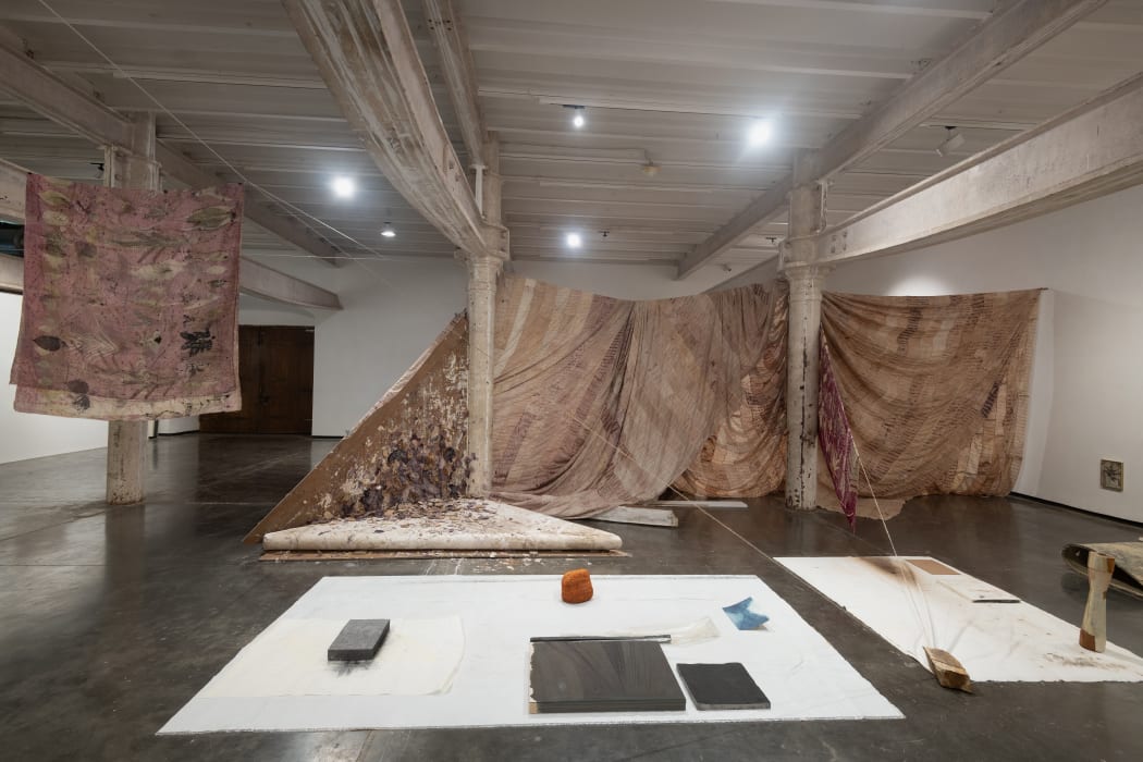
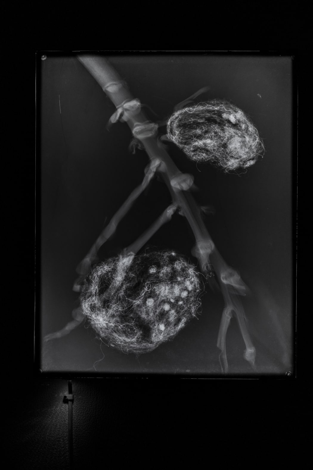
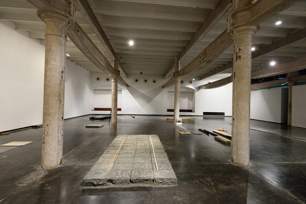
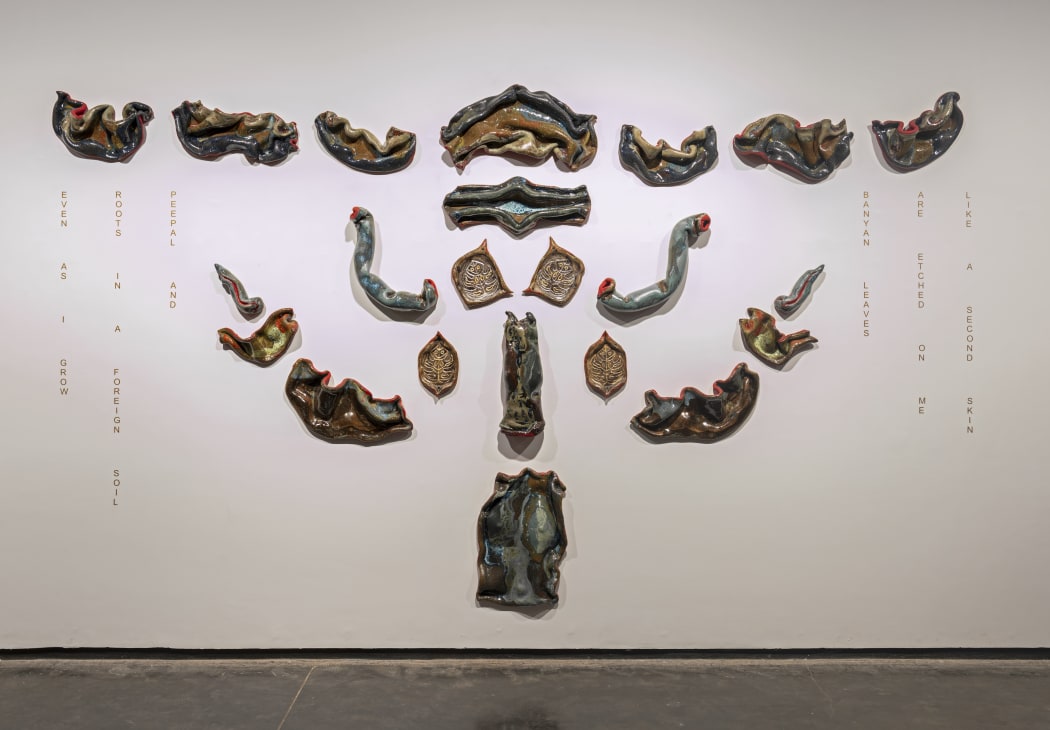 Ashwini Bhat, Self Portrait, Tree of Life, 22 glazed ceramic segments and vinyl text, 10 ft x 16 ft (approx.), 2023
Let us walk, together.
To say that the transdisciplinary practice of Ashwini Bhat, spanning ceramic sculptures and installations, videos, and performance, is deeply entangled with the artist's respect for the natural world-that is, the organic, the non-human, and the more-than human-is to speak one partial truth. With this truth, we can begin to understand how Bhat's walks along her local Northern California landscape-through towering thickets of redwoods and across forest floors once scorched by flames, now teeming with new life-embedded themselves deep into the folds of her abstract ceramic sculptures and across the skin of their sinuous forms and textured surfaces. Tracing this path alongside Bhat, we expand the possibility of understanding the self in its expanded field, a "self that touches all edges," to quote Wallace Stevens.
-
Poesis Of Numbers: The Sculpture Of Sushen Ghosh
By Anshuman DasguptaAs one enters the compounds of Nandan – the administrative building of Kala Bhavana, one comes across on the right, a free-standing ‘wall’, which, while being significant in proportion is quite non-intrusive in its repose. Bearing variable, asymmetrical vertical folds, this accordion-like structure segregates the two spaces of admins and creation. Resembling red sand stone, the cement-cast wall is not obstructive enough to stop one; it only proposes a temporary halt, a gentle musical interlude, as it were. Like a piece of folded origami resting on the gravelly grounds, its eastern face offers up vertical triangular projections. The back is flat, broken by vertical grooves of corresponding variable widths. There seems to be some kind of a rhythm in the asymmetry of the folds and grooves, some sort of subtle progression that impinges upon one’s senses like the notes of music. -
Approaching Limits
By Sonali BhagchandaniIf limits signal a hostile boundary – or a presumed end – of material or thought, why approach it? And at this concrete edge, what can you even find? Sandeep Mukherjee taps into an unusual but uncanny impulse from the very onset of this exhibition, wherein a deliberately orchestrated atmosphere unsettles your gaze. From afar, antagonistic structures are juxtaposed against one another, but as you move closer, these material antipodes (pushed to their extreme edges) stage the necessary contradictions that make (and unmake) our perceptual realities. The limit is not transcended nor does it collapse; for Mukherjee doesn’t fathom escapist pathways, rather, he compels viewers to “think through the end limits of our [human] condition.” [1]
-
Spectral Theatre
By Ritika BiswasUndoing Spectrality
a body vanishes from the surface/ its remains seep into the stage-screen/
diatomic actors flicker in the sky-light/ a chimeric dance across thresholdsThe ghosts of words and borders continue to haunt artists of colour in global contemporary art stages. What does it mean to inhabit that stage with a script and process of one’s own making and the spectrality of one’s selves? This question not to merely extend the semiotics of the title, but to materialise and visualise what is often unuttered, unspoken, and unthought but deeply felt by many who inhabit these multiple non-/bodies. Going from the auteurist (situated within the artist as self and anthropocentric) to the planetary (situated alongside non-human bodies and more-than-human technologies), the tethers between Sandeep Mukherjee’s and Rohini Devasher’s praxes, respectively, create a spectral spectrum of responses in their makings.
Not simply a return to the ‘spectral turn’ of the 1990s-2000s academic sphere and Derridean deconstruction, Spectral Theatre also gestures to the anxieties and joys in the failures of performing certain materialisations and politics of assumed corporealities that in turn render ghosts of us who do not. And these seemingly spectral existences must be part of the larger discursive realms where geopolitics, science, art, and critical discourse commune. We inhabit the spectral in teleological modes. This text is not about why or how ghosts exist, but rather what can spectrality reveal; an invitation to dwell within the spectres of our present(s) and present selves, both speculative and lived. Hauntings are not necessarily nefarious or burdensome, but are propulsions to consider the unseen and incomprehensible. We exist within imminent threats of extinction, in individual and collective reckonings, be they through the ceaseless breakdown of socio-political and capitalist systems that are snowballing the climate apocalypse, the difficulty of being both human and non-human bodies in a differentiated ways, or the slow toxicities of living in an inequitably dying world. Spectral Theatre hovers among these liminalities of human and non-human mortality as well as the joys of encounter in phantasmic gaps that acknowledge and live in and despite these knowledges.
-
About Love: An Offering…
Essay by Anne Couillaud“An exhibition is a temporary realization of something that we want to be perceived on a level beyond whatis visible.” [1]
There is a gentleman dressed in his mother’s sari sitting among us.
We are in the presence of a decade of works by Hemali Bhuta, or as he would say, we are seeing them “in the flesh”. We are letting them fill us… bleed on us…We came for this, we were waiting for this… at times solemnly, at times giggling…
Like in Marguerite Duras’ writings, ellipses have become our way of communicating…
In Duras’ novel Moderato Cantabile, Anne says: “I would like you to never stop talking…
Closure is resisted…Always… Inconclusions…
We are reading while writing… A candle is lit. Immense sadness…
A painting in indigo of a photo taken by the gentleman of the Subarnarekha river appears on my screen.“Infinite time rocks the earth, the ebb and flow of the tide. The world turns. My pulse is beating and my veins throbbing. And in wonder, my song bursts forth” [2]
-
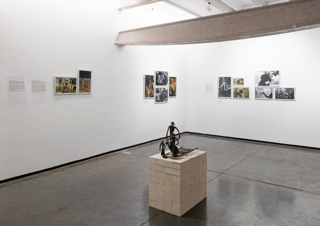
Meera Mukherjee: Photographs By Arun Ganguly
By Tapati Guha-Thakurta and Adip Dutta“I realised that something momentous was happening…” This is how the octogenarian photographer, Arun Ganguly, looks back on the first time he began photographing the working process of Meera Mukherjee at her residence on Paddapukur Road in Bhowanipur in January 1978. It was indeed the beginning of a remarkable encounter – a coming together of the creative engagements of a sculptor and a photographer, where each of their acts of image-making entered into a deep dialogue with each other. The photographer had by then stepped out of his successful career in the advertising industry to pursue his own line of professional interests in freelance and commissioned work. Introduced to the artist by a common friend, Kishore Chatterjee, the immediate requirement of preparing colour transparencies of Meera Mukherjee’s works for an illustrated lecture she was due to present (possibly at the Fine Arts Faculty at M.S. University of Baroda) expanded into an intense stage-by-stage documentation of her process of sculpting in her reworked indigenous cire perdue technique. Aware of the limited life of colour photography, Arun Ganguly set up a parallel camera with black and white film to produce his own photographic archive on her working methods that he developed over several seasons of her work. -
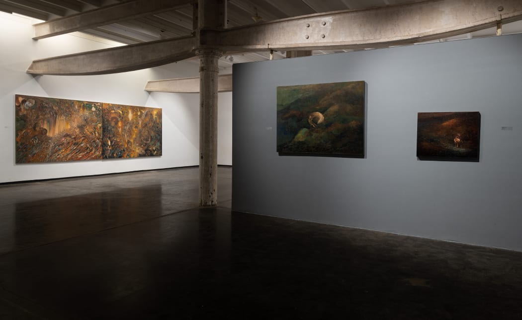
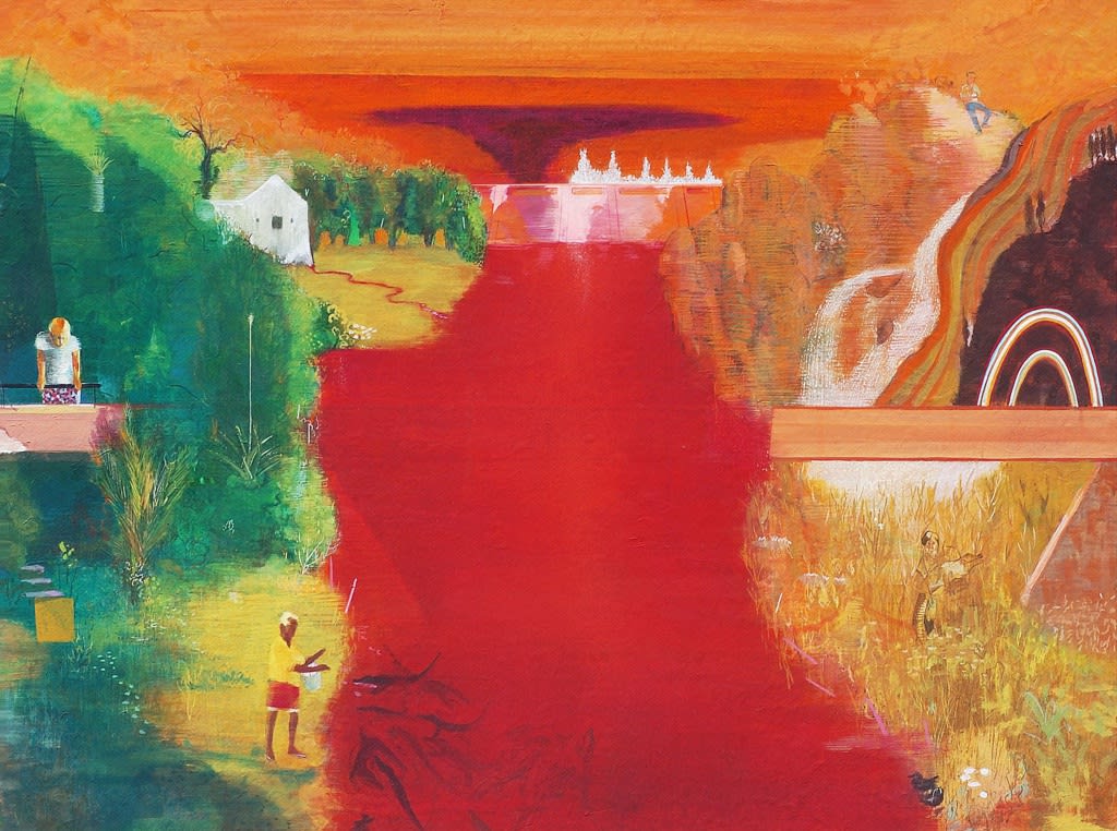
Tropisms: Recent Paintings by Amitesh Shrivastava
by Ranjit HoskoteThe first thing we notice about Amitesh Shrivastava’s paintings is that they are, above all, celebrations of painterliness; they are, in the art historian Heinrich Wölfflin’s sense, malerisch. The brushstroke is the formative unit in these works, varying in its handling of paint from a robust impasto to a velvet sleekness. It is no exaggeration to suggest that there is a legitimate Old Master intensity to these compositions, which are sumptuously layered with burnished, palpable browns, greens and blues, and pulse with events. Shrivastava’s personae emerge as apparitions in a world crafted in chiaroscuro from torrents of water and currents of flame, tides of shadow and hypnotic suffusions of afterglow. -
The Heart Of The Heart
By Pallavi Paul“Ghosts do not haunt, they regress. Just as when you need to go to sleep you think of trees or lawns, you are taking instant symbolic refuge in a ready-made iconography of early safety and satisfaction. That exact place is where ghosts go.”– Max Porter, Grief is the Thing with Feathers (2015)This place to where ghosts regress isn’t always allotted to a time before the arrival of sleep. Sometimes one finds oneself transported to this corpse through the most wakeful and banal encounters. Since the outbreak of the pandemic, the grating bareness of death, illness and precarity has seeded itself within the symbolic refuge of early safety that Porter alludes to. Now the ghosts are among us, our consociates. The churn of our time impels us to invent a language to honour this alliance and find a way to grieve collectively. Tested obituarial modes of lament, eulogy, and regret don’t suffice anymore. The sheer scale of loss, its systemic underpinnings, and the ongoing efforts of the state to deny its occurrence and erase its memory call for a recalibration. How do we relate to the too many we have lost and the world after their departure? The comfort of regress and the transformative potential of the encounter vie for spiritual legitimacy in the audience of ghosts and beings alike.
-
52 Proposals For The 20’S
By Prajakta PotnisPrajakta Potnis , How To Decide Which Human Gets Your Last Ventilator
By Emily Gallacher Viall (Emily Gallacher Viall Is A Nurse And Poet)
-
Wooden Horse In Boggy Land: Four Propositions About Landscape
By Prajna DesaiIn looking for landscape—
Eyes by the windowsill wait for the brain to light up the slope of the hill. Thought cuts a strobe to the farthest reaches of the horizon. Beds of flowers appear at the edge of a dry riverbed. Great green grasses shiver on scorched plains otherwise racked by so much wind the stones have gone blank. Slowly, filling with crags and scars and pretty fossils, the stones begin to tell how old a land is. Landscapes get plucked out of land that may not exist as one would like. Art beguiles by such landscapes. Even when they are ravaged, there is hope they will be beautiful, because landscapes are not so much fact as inventions of artistic material. This is the conviction that secures them a place in imagination. The same, one might hazard, reveals an economy of the blind—a system of entitled visionaries who power weak suns with their desires.
-
8688
Walk-Through By Diana Campbell Betancourt8688 is an exhibition that challenges our perception of opposites. It is only by looking as far past ourselves as possible that we can understand what makes us who we are. The exhibition turns Project 88 on its side (a conceptual gesture evoked by Shuddhabrata Sengupta of Raqs Media Collective, who by doing so, found “double infinity”), and in light of current events drives home the importance of extending hands across the divide. -
A Note On STALKINGS AND OTHER STORIES
By Prajna DesaiOne thing after another.
The ecstasy of narrative begins early, inside the womb while listening to the story from the other side, at the playground with imaginary companions doing your bidding, or in that first fib about how you got a black eye at school. When bringing up ‘narrative’ what we’re really talking about is expectations, about the plausibility of material presented and how to reckon with its claims, one thing after another.
So intertwined is narrative expectation with flat surfaces – let’s call them drawings and paintings – that some deem the genre a much too safe creed. For if a drawing or a painting is living up to expectations, it must also presume their residence, somewhere, in a fictionalised receiver. You. The useful idiot. That’s what it boils down to.
-
On Entering A Quarry
By Nida GhouseOn entering a quarry, one enters the earth. One descends into that which as long as it existed could not be accessed. A rock is a record of everything that formed it—the magma of millions of years since a volcano erupted. Inside a quarry, the surface of the rock is the ultimate intermediary; its exposure to forces of extraction leads to the layer beneath. An image of a quarry is always a negative; it is that which has been excavated that enables the image to come into being.
-
When The Wind Blows
By Atreyee GuptaWhen the wind blows. Quotidian objects of domestic use – table fans, chopping boards, kitchen mixers, synthetic packing material – take on the semantic and material qualities of drawing, photography, and sculpture to chart conceptual routes between drawing and photography, photography and sculpture, sculpture and installation. Parts of appliances, even those that have outlived their quotidian usefulness and have now transformed into urban debris, are recovered and reinserted into fantastic imaginary topographies. -
Passages From Reclusive Conversations
By Prajna DesaiEmperor Joseph II: My dear young man, don’t take it too hard. Your work is ingenious.It’s quality work. And there are simply too many notes, that’s all. Just cut a few and it will be perfect.
Mozart: Which few did you have in mind, Majesty?-From the Hollywood film Amadeus (1984)
Directed by Milos Forman / Written by Peter Shaffer
Adapted from Peter Shaffer’s play Amadeus (1979) -
Earthbound/ Earth Bound
By Maya Kóvskayaearth·bound
ˈərTHˌbound/
adjective
adjective: earth-bound
1. attached or restricted to the earth.” ~a flightless earthbound bird.”
2. attached or limited to material existence as distinct from a spiritual or heavenly one. ~”her earthbound view of the sacrament.” -
Noise Life
By Kaushik BhaumikThis show will baffle visitors for many reasons. For one, there is a lot happening within it that will seem chaotic and pointless. Then there will be the interference between noise and image. This relationship between noise and image occurs either within frames, or between frames of performance. To make things worse, none of this is to be explained by the authors of the show, especially in terms of telling people what things within the works mean. Let alone meaning, the authors do not even wish to tell the audience what the things we see or hear are. Much that is familiar is distorted to the point of non-recognition and there is a lot that is unfamiliar. Such distortions will make easy ‘recognition’ of elements of the work as referencing the familiar or the known historical close to impossible. -
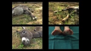
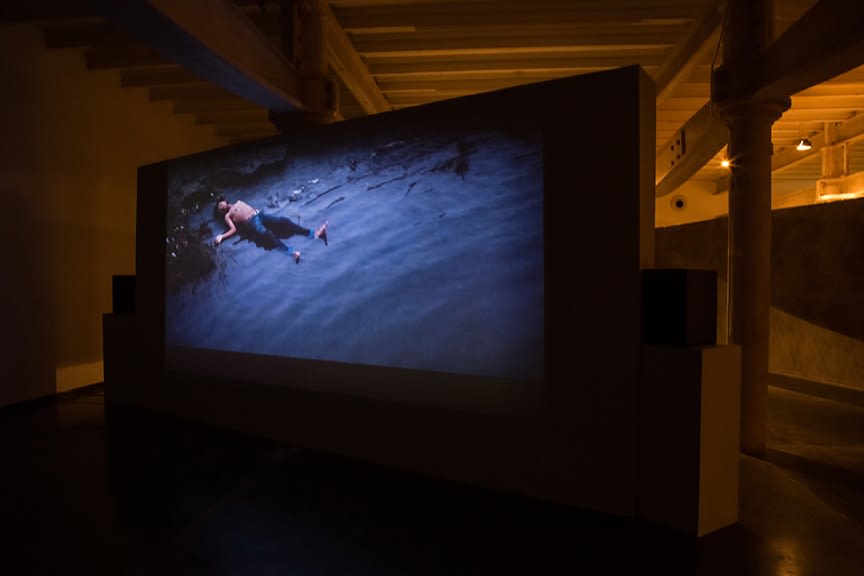
Touched
By Neha ChoksiOrganized annually since 2009 by the Whitechapel Gallery, Artists’ Film International showcases artists working with film, video and animation, selected by 14 partner organizations around the world and presented over the course of a year at each venue. This is the first season Project 88 has participated, represented by my Minds to Lose, 2008-2011. A series of 8 collaged drawings based on the performance of Petting Zoo and the related video Minds to Lose will be on display. I have selected the following videos, Ana Gallardo’s Estela 1946/2011, 2012, Kaia Hugin’s Five Parts—A Motholic Mobble (Part 5), 2012, and Katarina Zdjelar’s My Lifetime (Malaika), 2012, to show alongside Minds to Lose. -
No Less A Drawing
By Prajna DesaiThere is the honoured way to draft a picture, to let a tip nick a surface. This is how drawing began when a point was pushed to make a mark. Beyond running on paper a pencil or pen, lead or ink the colour of soot, or caramel, one might even use fabric, film, or a wall, so that even a doodle on a train reflects the wonder of drawing. Though some drawn marks have been known to travel over land and also rocket into space through acts of walking, dancing, and speaking figured as art. Beyond this performative life of line, there are others which plot and plan. To fill a yen for a fictitious tree, for instance, one first imagines a green blob gradually pared by a point keen as a laser dot—this mental process describing an idea, or delusion depending on who’s seeing it, is no less a drawing. As everyone already knew.Exhibition text by Prajna Desai, Curator