
One thing after another.
The ecstasy of narrative begins early, inside the womb while listening to the story from the other side, at the playground with imaginary companions doing your bidding, or in that first fib about how you got a black eye at school. When bringing up ‘narrative’ what we’re really talking about is expectations, about the plausibility of material presented and how to reckon with its claims, one thing after another.
So intertwined is narrative expectation with flat surfaces – let’s call them drawings and paintings – that some deem the genre a much too safe creed. For if a drawing or a painting is living up to expectations, it must also presume their residence, somewhere, in a fictionalised receiver. You. The useful idiot. That’s what it boils down to.
Establishment will protest.
Painting and drawing have come far from pandering to the narcissism of a traditional viewer. How about those satires and subversions, those critiques and polemics, those philosophical extrapolations? Do they not exist? Certainly. Only, these celebrations of non-traditional narrative seem to have forgotten about highly narrative pictures that float free of radical departure.
Right from the start, Rehaan Engineer has yoked fine line drawings and words, written either by hand, typeset on a manual typewriter, or inked with a rubber stamp on paper substrates. His basic vocabulary is as much the balance between clean drawing or simple photographic transfers and often incredibly noisy crypto- ironic text as the A4 size surfaces he favours, for subjects ranging philosophical texts, diaristic content, and elemental shapes, such as friends’ and lovers’ mouths. In contrast, Sanjeev Mirajkar’s painstaking photorealism – some might call it a throwback to still-life painting – uses the forms of moulded packing material to create images of architectural spaces he would like to inhabit, but prefers never get built. Speed of conception might easily be Amitesh Shrivastava’s calling card, democratically applied to small pen and ink drawings and sizeable acrylics made of high-velocity tache-painting, often inflected by the personal experience of having migrated to Mumbai from Chhattisgarh.
What brings us here, then, is a curiosity for the narrow vocabulary. It forks, splits off further, reaching, much like a stalk, producing a wide range of atmospherics, then breaks off to keep its stalk-ness. You will find no moral lesson about influence and evolution, or about negotiating the tastes of our time. If you are still reading, you have already slipped the anchor of art history, anticipating, perhaps, its accidental eclipse.
Welcome to Stalkings.
Why not again an antique claim
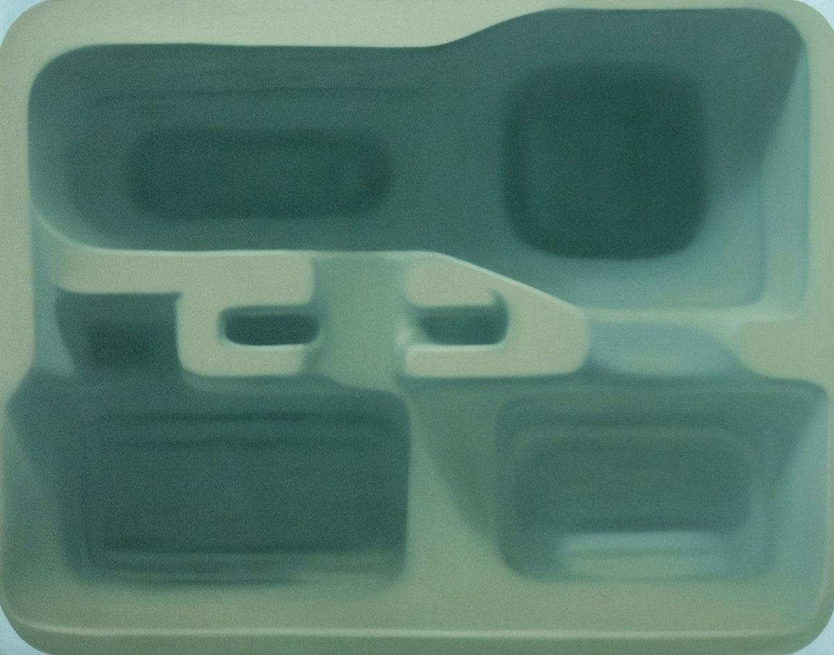
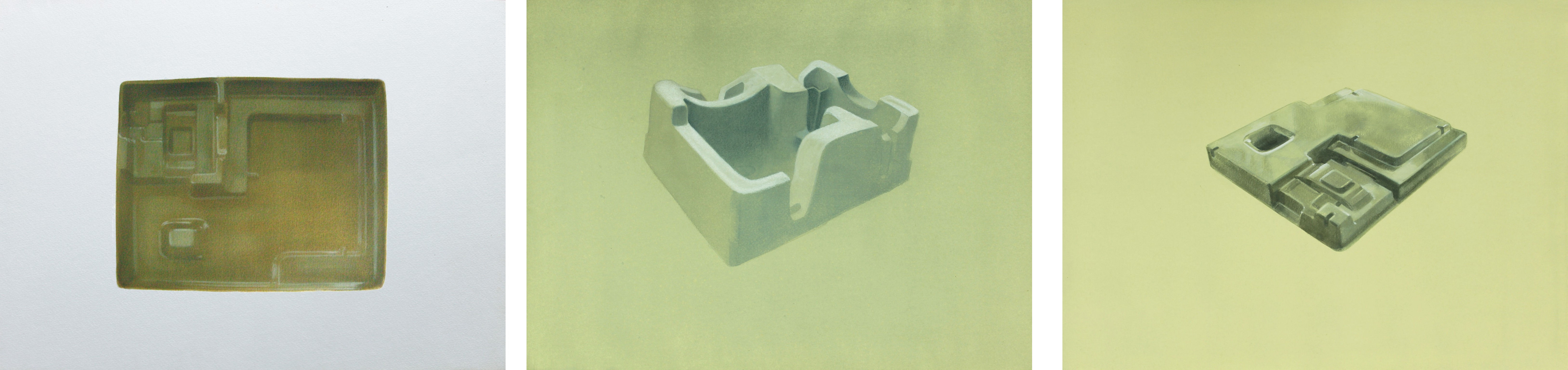
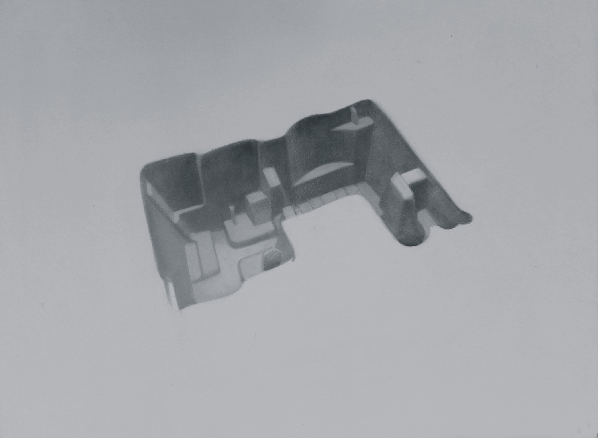
That irritating tradition in some quarters of contemporary art of seeing beauty as the enemy of ideas is easily dispensed with if your world is a blazing paint box. When Sanjeev Mirajkar first started on his colour-rich patterning of space he might have been painting the metaphor of spatial hollowness his pictures inevitably present when prefaced by references to the rock-cut temples at Ajanta in western Maharashtra, or his personal practice of meditation. Once significant, these catalysts have since been succeeded by other impulses.
Somewhere along the way the painter cultivated a fondness for the prolix physicality of memory packing, those plastic, cardboard, and styrofoam moulds cladding household appliances and electronic devices to keep them from damage during transportation. When relieved of its contents, the monochrome packing mould would seem to evoke the vast hush of the rock-cut interior that once awed the painter. This is what he ostensibly began painting.
Ostensibly.
But first, he cajoled the packing to model for his colour palette before it could assume an identity sometimes reminiscent of 3D image renderings in design and architecture. In effect, the bold, lush canvases are still-lives in extreme close-up. Margins typically jettisoned or reduced to slivers, the image swallows the limits of the frame, lying as still as stillness gets. The tantamount force is fiercely totemic, stressing the inadequacy of the thing – the static mould – that incited it. Instead, what carries the seduction of something that is not of life but parallel to it is colour.
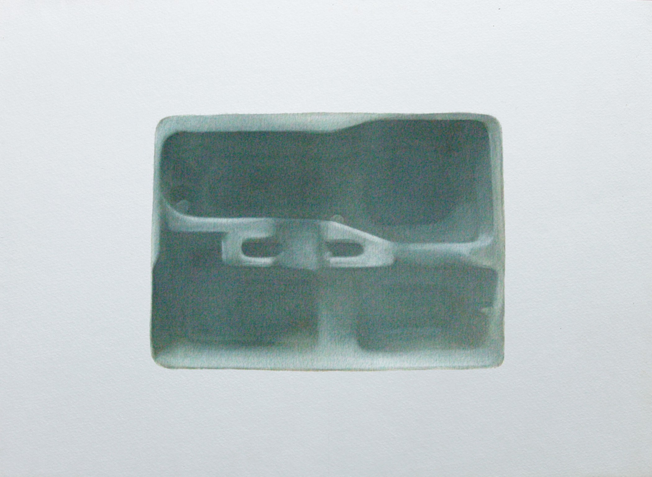
Always a correlative of itself, rather than experience or sensation, and at no point saturated in any one place enough to work as filler or flourish, colour is a dramatic structure relieved of a descriptive function. There is no way to tell what kind of sensation a celadon green mixed with chalky copper green is meant to convey. These quiet modulated passages, broken up by belts and ribbons of shadowed areas, guide the eye before the intellect has acted upon the subject matter, making the pictures of colour; to imagine them without is to think of the watercolours he made for two years before the canvases became paramount, painted in a thin, almost grey light of judgement and investigation, and clearly proposed as singular objects against a blank slate.
Back in the paintings, the dominance of chroma leaves the frontal view of curves, overhangs, chinks, and secreting corners to chart the animated gap between minute subtleties of proportion, shape, and volume. So, no matter how similar the paintings might seem, they behave as differently as creatures from different planets.
Mirajkar’s stalkings lie here, so to speak.
I PORTRAIT
If a portrait is a visual philosophy of the self, then different kinds of portraiture would express an existential rather than a moral distinction. Because a portrait would be defined by how the self is understood.
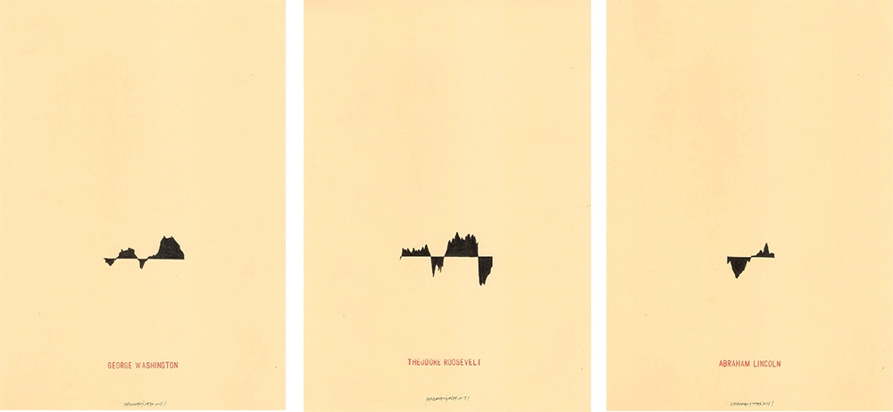
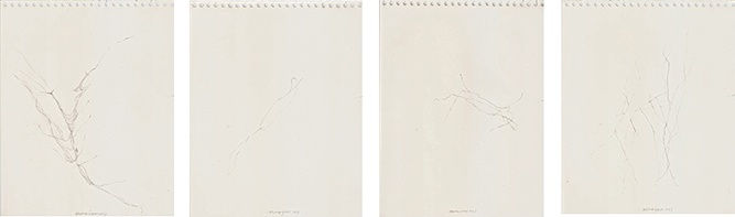
Metonym: Presidential Portraits by Rehaan Engineer cuts to chase. In this series of portraits of American presidents since the formation of the country, faces and bodies are traded for the graph of the American economy during each presidential tenure. By this, it is clear that a president is less person than changing condition expressed as non-interacting episodes lying on a single line. Why? Perhaps because free will does not exist. Things happen. People, presidents, are borne by the nature of the defining condition, captured as the peaks and ravines of capital accumulation or dissolution, steadiness, rabid scaling, or a dull lumbering that disappoints the money makers, the war-mongerers, and the export tycoons.
Obviously against the swim of a world towards constant political education, mapped against a depthless yellow sea, the view of such men is gleefully anti-sentimental. Who rules, what they represent, their platform, policies, and prejudices, can become the crucial stimuli for social and political change. Should it not matter who the president, prime minister, is? Not for someone who doesn’t give a toss about politics. Self-deludedly? Perhaps.
There is, of course, this: Faces can be distinctive things. People perhaps ever more so. Pictures of faces build reactions that occur in ignorance of the sitter’s personality, while granting the pleasure of believing one has plumbed something of his or her depths. Any good portrait of the classical kind would produce such an effect, obtaining a special stripe on the artist’s shoulder as truth-teller. All to say, Engineer’s portraits are kinder than most.
It’s not just what you draw, but also what you don’t within the specific capture of your image. Exsanguinated and disembodied they may be as pictures of people paralysed into dark jagged forms, though keeping intact what we could never really know about their humanity anyway.
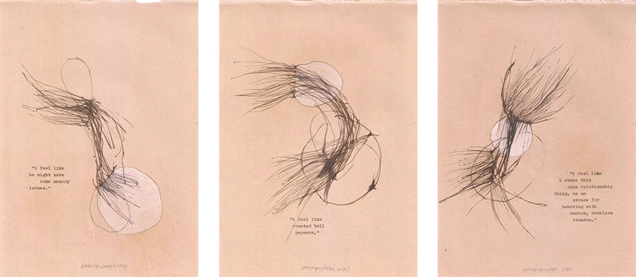
In Vinit Like-ness, emotional attachment to the named subject intensifies this effect of preempting complete knowledge about personality. Because the object of portraiture is not a person but the feelings of an intimate. The qualitative features of a person are reduced to a toolbox of looping and swirling filaments, linking and spewing out of pouch-shaped outlines. Executed on paper-bag brown surfaces, and sometimes filled with gossamer white, these formations, as fluid as deep-sea light-refracting jellyfish, reveal little of their mysteries through the typed snatches of texts that appear alongside
This puts Amitesh Shrivastava’s portraiture on the oppos
ite pole: knowability and the desire to know lie at the heart of his paired set of Dr Kureishi drawings and one large canvas. Dr Kureishi was a doctor of conventional medicine in Shrivastava’s home town in Chhattisgarh, eastern India, often called upon by people from surrounding towns and villages to resolve a variety of medical problems, including those of their stock animals such as goats and cows. Shrivastava’s memories of the doctor are muddled yet clear in two important aspects: the doctor’s speedy responses on his trusty two-wheeled scooter and the multiplicity of his accounts. While memory plays an important part in what becomes of the doctor in these images, it also maps onto Shrivastava’s own tendency to work swiftly and often produce the initial configuration of a painting within a few days, before spending up to a month on it to completion.
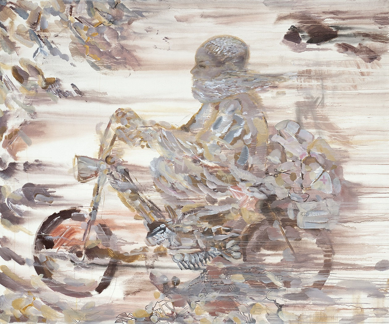
The large canvas Dr Kureishi is one such work, painted not like the thing itself but the effect it produces in the mind, of a man and his beard clearly on the move, arrested by fizzy, excitable smears, perhaps assisted by both the vigour and fleeting reliability of the painter’s recall, part clear, part shattered into soft shards of swiftly applied paint.
The energy carries over into the pen and ink drawings of episodic scenes reverberating a repeating set of motifs: profuse foliage, disarticulated animal limbs, hybrid, unidentifiable tools, as well as ursine creatures. From image to image, the twist of a tool, the varying thickness of line as it segues from tool to grass to animal creates the frenzied effect of ideas ferried back and forth, reliving, as it were, the vision of the good doctor as he went about his task, when the artist was a young man.
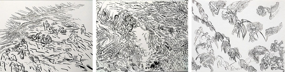
Hardly dark works, the drawings nonetheless live in the shadow of private dreaming. Exalted every now and then by theatrically dark, thick profiles and black-filled figures, they confirm the obsessiveness of recall that should connect but remains muddled, as if to suggest this is the unending work of organising a portrait. It is possible, but it may also lead to nothing. In contrast, the painting in its soft pleasurable sun of having made the portrait whole is clinching.
II PLACE AND TIME
Neither is easily separable from the other. Neither is easily expunged from daily experience. One or the other might predominate, but they more or less remain companions throughout, chaperoning each other when not hand in hand. That’s one version of how these two conditions exist.
The loyalties of Engineer’s Sentimental Seaside Music run to time in multiple frames evocative of the same view of the sea. Time passing and time experienced are both rendered as tonal variations, building visual harmonies that cash in on the classical equivalence between colour and music, and music with time.
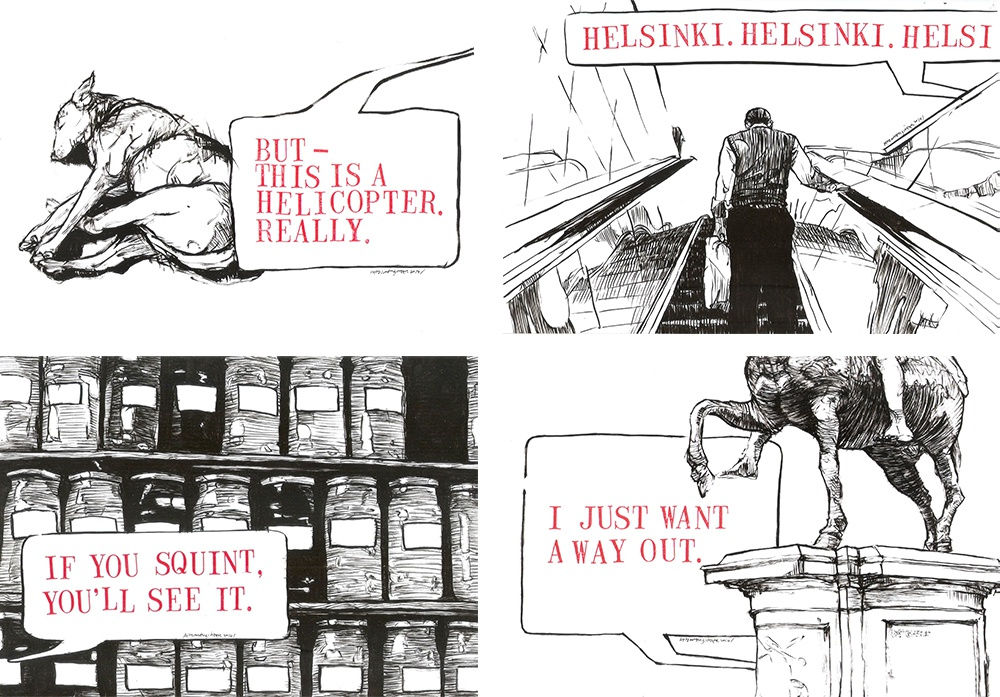
Faraway more playful is A Week by the Shore’s riff on the pernicious tests of place and time that vacations can be. You might be somewhere new or someplace familiar, but you are not home. You are in contemporary time but not in everyday time. That said, this work is hardly about vacationing per se. Produced over an extended period in 2014, it proposes the spatial dislocation of time away from time, with the shore as an excuse to broach the idea. Organised as an assembly of disconnected images – a box of cupcakes, a pedestal with a horseman statue, a shuddering light fixture on a ceiling, a napping dog – clubbed with fragmentary text that stands out for its brevity and pith, the effect is hallucinatory in the way montage can fix a visual or phrase in the mind and let the mind wander while the body remains affixed, by the shore, or elsewhere.
Time and place as cannibals. Mirajkar does not say: the internal picturing of his works suggests this can be the case. Hence the separation. One keeping time. The other building place.
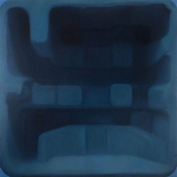
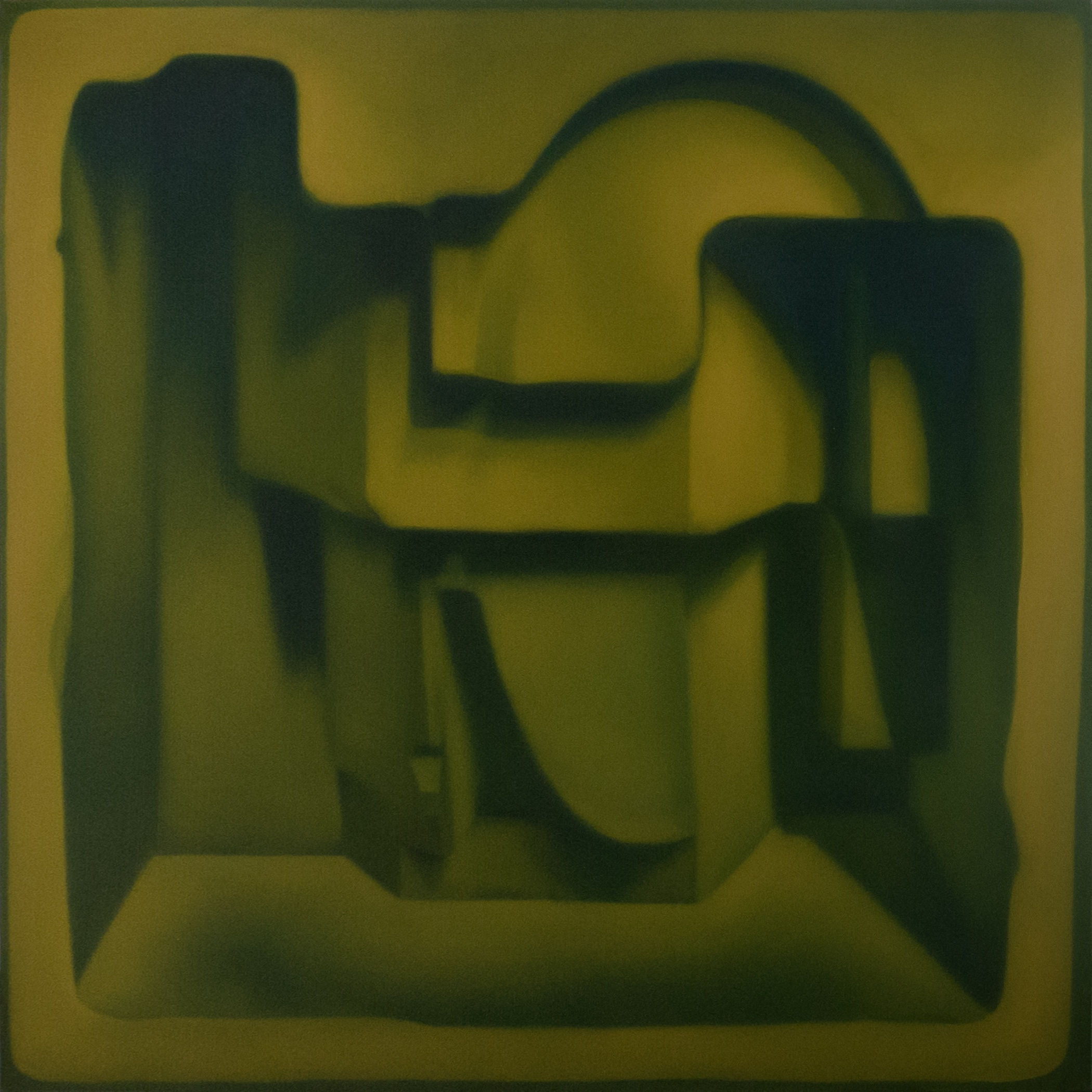
The monumental blue Untitled (2013), for instance, seems designed to prolong the act of looking, or prolong time, through the marriage of scale and recession, which is draped languorously across multiple ledges and broken off square brackets, all blue. A sea blue, a death blue, a bruise blue, a midnight blue—the subtle transition from one to another crippling the possibility of time slowing down. If this image is a place, it is hard to tell, because space, that elemental unit of place, is utterly in shadow.
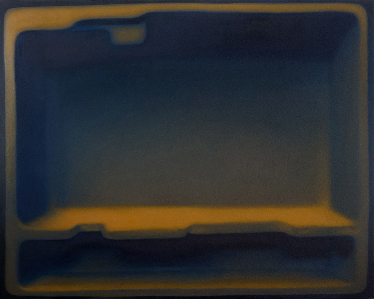
Switching this around is Untitled (2015), a fearsome, velvety image that confines its appeal to the gaze of someone who cherishes rest. Notably, this is the sole canvas work by Mirajkar on view with a clearcut margin giving it a definite thingness. It also stands out by the willed protrusion of shapes, easily grasped in one fell swoop of the eye. The dark, unarticulated depths register only as asides. Ultimately, what makes this picture especially place-like is the dramatic simplification of the lip, solid and smooth, and, obviously, habitable.
III COMEBACK
When a tree falls unheard in the forest, does it matter it happened? When a reaction comes into play without an audience, is it a reaction, or a conversation with oneself? The two sets of works here were made in response to incidents that bothered their makers, with a touch of moralising in each case that implies someone is listening.
Amitesh Shrivastava has been living in Mumbai for some years, commuting in the city, watching people read the newspapers and following updates about happenings – police raids, terrorist attacks, explosions, floods, tragedy, and political turbulence – in distant places, places like the town in Chhattisgarh he grew up in. He watches their reflex reactions, their emotions wrestling with imperfect information, their expressions of outrage or rage at the rain of hard-to-swallow statistics. To him, these individuals are ‘rage readers’. As social action, they constitute a retreat from truly grasping political realities.
His series of pen and in drawings Rage Readers (2014) takes up the contradiction of feeling much and knowing little as an opportunity to express the moral necessity of sharpening one’s existing thinking tools, before reacting strongly to situations out of one’s grasp. Aptly, the pictures are populated chiefly with contraptions of his own invention, actions resembling digging and seeking, and dogs and bears, creatures evoking perseverance and a nose for getting to the bottom of things.
Responding to the specific incident of the resignation of Pope Benedict XVI in February 2013, Engineer’s Seven Whirligigs for a Pope (2013) issues a punishment to Benedict for cutting short his duty before its natural end. It takes the form of a lark, which he names a ‘whirligig’. Note, however, this double-edged term refers to both, a winged, whirling toy, as well as its polar extreme, a torture device (see note below).
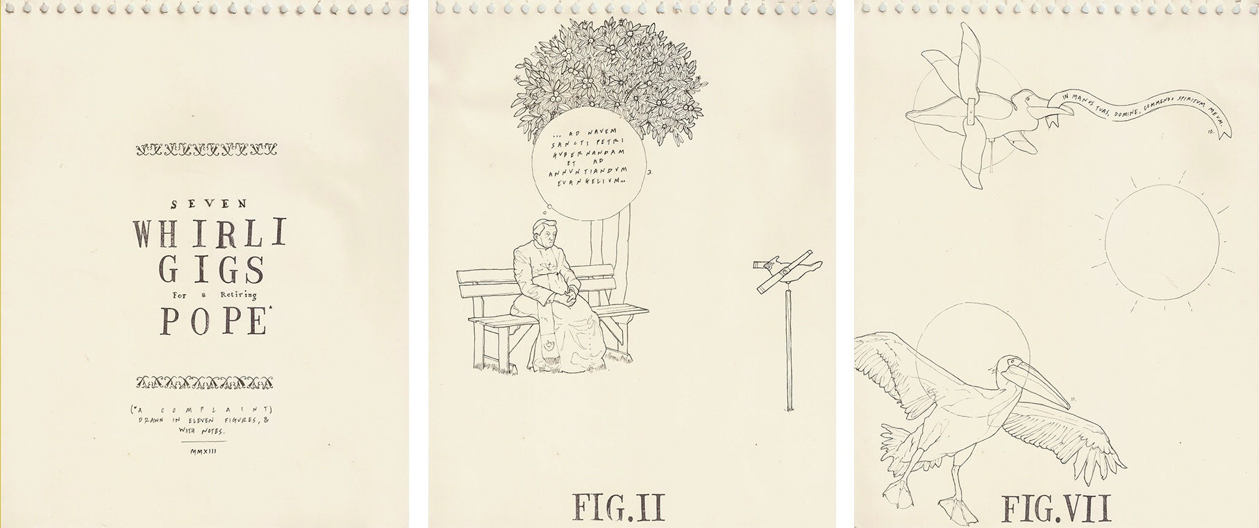 Rehaan Engineer, Seven whirligigs for a retiring Pope, ink on paper, 11 x 8.5 inches each, 2013
Seven images (or whirligigs) feature the pope confronted first by a single then numerous whirligigs that come to life as a chastising, educating pelican, symbolic of Christ, which mouths edicts from the Bible, Dante’s Paradise and Inferno, and A Proper New Boke of the Armoyne of the Birds (A Proper Book of the Harmony of the Birds, c.1555), attributed to Tudor poet and political satirist John Skelton who on occasion came to textual fisticuffs with the clergy. Cumulatively, in conjunction with excerpts from the Pope’s public resignation at the Vatican, the citations produce a punitive case against reneging what the Catholic Church considers a God-given calling, which only God can take away. Former Pope Benedict XVI is the only modern pope to have initiated his own resignation. The last one doing so of his own accord was Pope Gregory XII in 1415, and he did so to pre-empt the break-up of the church.
Note on ‘whirligig’
1. a child’s toy having a whirling motion
2. merry-go-round
3a. one that continuously whirls, moves, or changes
3b. a whirling or circling course (as of events)
Source: Merriam-Webster Dictionary
A whirligig is a punitive or torture contraption comprising a suspended cage-like device. The victim would be placed in the cage, which was spun violently in order to cause severe nausea. This was used as a military punishment, as by the (colonial) British Army. For example, in Tangiers, the whirligig was reportedly used on women, by whom it was more feared than the pillory, stocks and wooden horse.
Source: Wikipedia
IV DENSITY / FICTION
Density is difficult to fudge by its very definition of bulk and heft. For some its invention is realised by means of the opposite: hollowness. For others by showing its resistance to being assessed. These arcs respectively guide the two projects here.
The set of pen and ink drawings that make Dord (2013) are based on Engineer’s discovery: “A ghost word printed Webster’s New International Dictionary of 1934, defined as a noun used by physicists and chemists meaning ‘density’. In sorting out and separating abbreviations from words in preparing the dictionary’s second edition, a card marked “D or d” meaning “density” somehow migrated from the ‘abbreviations’ stack to the ‘words’ stack. The “D or d” entry ended up being typeset as a word, dord, and defined as a synonym for density. The mistake was discovered in 1939”, but expunged from the dictionary only years later, in 1947.
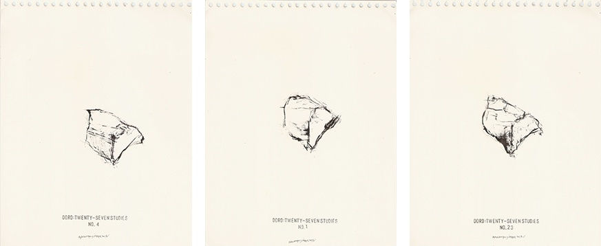
In the drawings, the word takes on a rock-like form, if not disposition, here marked by fine hairy outlines and a profusion of what look like lacy, inky thumbprints. To wit, we are looking not at a thing but at an image suggesting a nub of modelling clay whose malleability the prints evoke. Contour and outline lightly repositioned across twenty-seven case studies, with the form as a whole remaining in place on one side, Engineer’s fictional clay rock seems more and more likely as the thing the word could have invoked were it not a ghost.
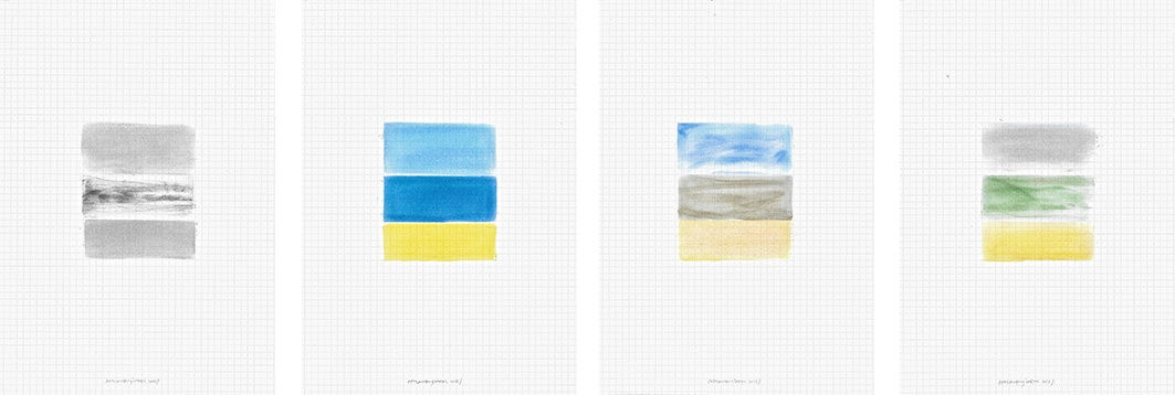
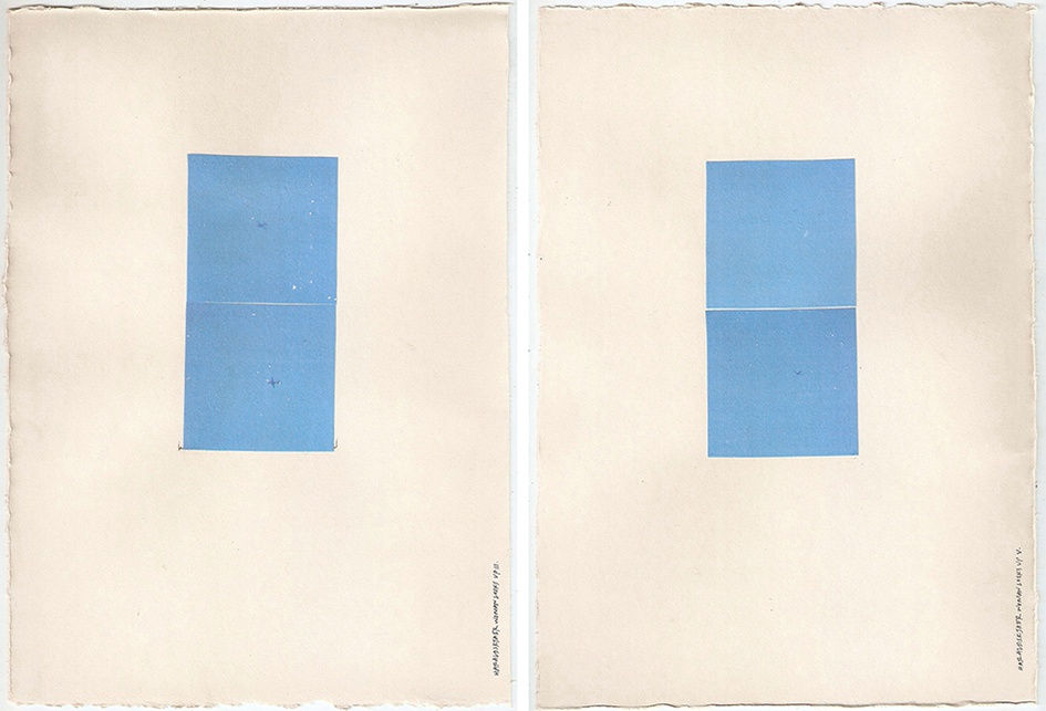
Mirajkar might likely baulk at the idea of his three small watercolours produced in 2010 having anything to do with a death mask, and yet it is there, a precise density that only a mask of something that once was might offer. These watercolours are unusual in presenting, for the only time, and early on in his interest in hollowness, a view that is askance and in one case from overhead, unlike the later resolutely frontal oils. With the ease that hindsight lends, one might say these early works are perfect fictions, pressing the haunting of density within hollows that come to life as maquette-like forms and a cutaway hollow sunk into the ground. The architectural filter is clear, but the conceptual method that makes these works a linked set is akin to the process of producing a death mask. A workable material is pressed onto the face of the dead to lift a perfect impression of something that is no longer ensouled. So while the inside of the mask bears the true image, or soul, the outside is moulded to embody the impression with lifelike features. The death mask in effect is both fiction and density, neither possible without the other. Showing the inside and outside of the alleged death mask, these watercolours, as a group, presciently accrete what a recent painting from 2016 distills into an empty chamber, both dark and luminous, relieved of the intricate divisions that characterise the other canvases—hollowness as easily as it is density.
V SUBSTITUTIONS
There comes a time when things ask to be flipped around, turned inside out, pushed out where they have been in. And when this seems like too much of an effort, it makes more sense to pull things apart, annul your most basic support, to make way for new ideas, or simply add notes to explain what it is that one’s doing. Adventuring like this can be refreshing, if extreme, bringing the weakness for a certain vocabulary to the fore, attenuated to an extreme, substituting what one has clung to so far with their darker alter egos.
Two recent works by Mirajkar capture precisely such a process, as it were, where clarity and confidence, perhaps the second hallmark in his paintings after silence, give way to questions and some confusion. A visual portmanteau of everything he has crystallised and isolated in previous works falls away in favour of a goulash of possibilities. Clean edges, reliable sides, transitions, focus, and fathomable depth are stifled by the bug to experiment.
In the untitled watercolour (2016) a sudden ledge comes out of nowhere pushing into the recess at a cant. A strange shadow is thrown inside in a deep recess by an unknown source within. In the untitled oil (2016), the entire image feels like a flabby fantasy of dark olive green and black furrows and wrinkles, in utter deviation from Mirajkar’s usually disciplined anthropology of forms. That these are recent works, produced years after his first explorations, might explain why his spaces might be trying on new clothes.
Barring some exceptions, pairing images with words, however brief and telegraphic, is, for the most part, how Engineer’s works operate. But not in For where the text says.
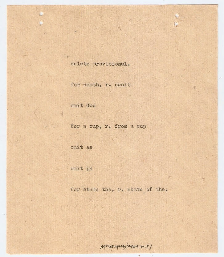
What makes this series rather surprising is that Engineer’s projects at large are at pains to clarify, both by extending a quality or idea across multiple frames, and through textual qualification and annotation, but always with a touch of the cryptic and the unsaid. In contrast, this purely textual piece is far more expository and open to explaining what to read in place of what is given. As a kind of thing, it has the qualities of an errata, which provides a clearcut list of corrected errors. Not quite this, the feel is nonetheless resonant, with the inbuilt admission that the initial offering was lacking in the clarity it ought to have contained.
VI LOOKING AWAY
What’s to be seen when the gaze turns from what it knows? Questions, certainly, and also the world around. And if all that time the eyes have been cast down at the earth, the gaze has nowhere to turn but to the sky.
Hesitation Clouds by Engineer begins at this position, with the sky standing in for uncertainty simply by being looked at, while Haraldskær woman looks up lets a woman dead for centuries who was discovered in the titular bog indulge in a bit of day-dreaming and, astonishingly, gives her a glimpse of an airplane, simply by being turned over and allowed an unhindered view of the sky. In the former work, the pleasing appearance of tears and chinks in the colour, no doubt a result of the acrylic transfer process, have the serendipitous effect of evoking someone looking up at the sky, pleasantly startled by the new.
 Rehaan Engineer, Haraldskaer woman looks up, acrylic medium transfers of digital photographs & typed text on paper, 11 x 8 inches each, 2013
Something like accommodating itself to the open vault above is also why the inward-looking surfaces in Mirajkar’s most enigmatic work, a watercolour from 2009, the kind he never painted again, turn glossy and reflective, gleaming, so gleaming with the world he usually shuts out.
Shrivastava’s Weaver, for all its sweetness of colour, is a colder, somewhat eerie meditation on looking away, a brown study, if you will. Two bears appear at the flanks of this large acrylic painting. The little one to the right looks upon a hazy figure handling a massive cloudy mass rippling down into the ravine. Wool perhaps. The larger bear, leaning on a giant weed puller or crutch, is also taking in the scene. By the title we are led to expect a weaver. The curious bears, seeking a different view, see a man engaged in wool gathering instead.
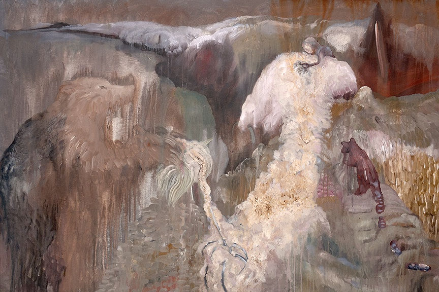 Amitesh Shrivastava, Weaver, Acrylic on canvas, 72 x 48 inches, 2015
Animals, particularly dogs and bears, have a special place in Shrivastava’s imaginative realm. Looked upon as a group, his paintings, only some of which are displayed in the show, enact the dynamics of a bestiary, where animals posit ethical and philosophical values. Unlike the medieval bestiary, where animals allegorised moral corruptions, Shrivastava’s bestiary reverses the animal’s role, makes of it a seeker, a trouble-shooter, an aide, a saviour even.
Whereas the works are entitled Rage Readers, Weaver, Librarian, or Diggers, creatures not people are the protagonists drawing our empathy, individuals our confusion and questions, barring Dr Kureishi. In other works, anonymous individuals marked only by their profession might well stand in for a roster of human behaviours whose complexities only the animals are able to articulate.
However, it is the paintings alone that extend the idea of the animals as necessary if inadequate translators of humanity. Conker-brown, sand-brown, earth-red brown, and tans of various orders inspired by the local artistic traditions of Chhattisgarh come to grips with the palette of urban life: icing pink, Wedgewood blue, sulphur light yellow. Whites are dirty ostrich, dull ivory, and a soft-pink-blue, but never clean. Only the brushstrokes, hurried, prolific, and large are able to offer the clarity the pictures themselves withhold in their deliberate muddles. It’s fair to say that Weaver is a metaphor: look away to procrastinate.
